
Color is one of the most powerful tools in trade show booth design. It influences mood, captures attention, and can even sway purchasing decisions—all within seconds of a visitor spotting your space. Understanding and applying color psychology allows you to create a booth that not only looks great but also communicates your brand values and invites engagement on a subconscious level.
In this post, we’ll explore how you can use color psychology creatively to design a trade show booth that resonates deeply with your audience and drives results.
Why Color Psychology Matters
Humans react emotionally to colors, often without realizing it. The right color choices can:
- Grab attention and make your booth stand out
- Set the tone and mood of your brand
- Influence visitors’ perceptions and behaviors
- Reinforce brand identity and messaging
By strategically selecting colors based on the emotions and associations they evoke, you can create a memorable experience that encourages visitors to stay, explore, and connect.
The Basics of Color Psychology in Marketing
Here’s a quick overview of common color associations that are useful for trade show design:
- Red: Energy, passion, urgency, excitement. Great for calls to action or creating a dynamic vibe.
- Blue: Trust, calm, professionalism, reliability. Common in tech, finance, and healthcare industries.
- Green: Growth, health, tranquility, sustainability. Ideal for eco-friendly or wellness brands.
- Yellow: Optimism, warmth, creativity, attention-grabbing. Works well for cheerful, innovative brands.
- Orange: Enthusiasm, friendliness, confidence. Invites interaction and spontaneity.
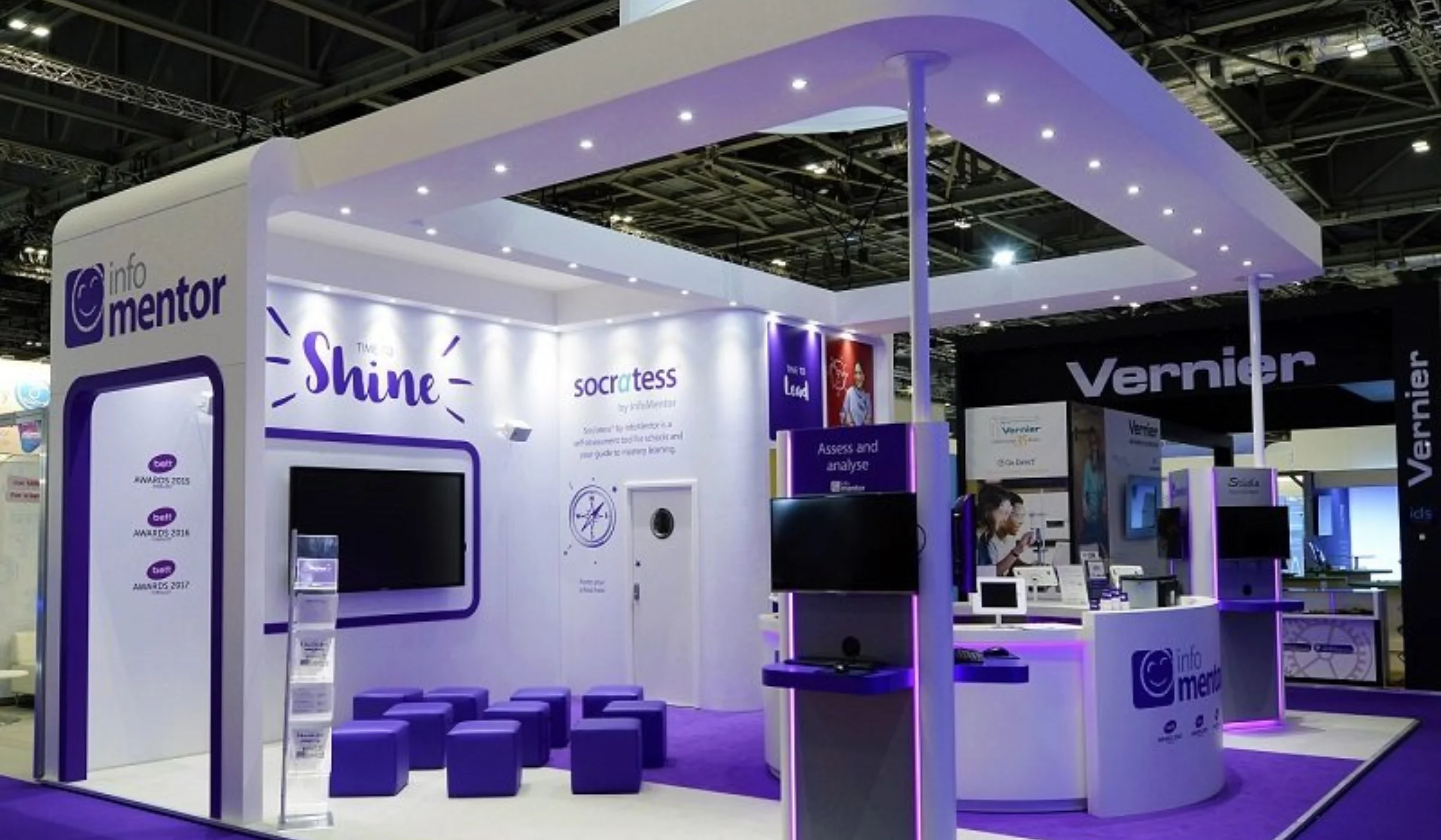
- Purple: Luxury, creativity, wisdom, sophistication. Great for premium or artistic brands.
- Black: Elegance, power, sophistication, authority. Adds a sleek, modern touch.
- White: Simplicity, purity, cleanliness, clarity. Creates a minimalist, open feeling.
How to Use Color Psychology Creatively in Your Booth
1. Choose a Dominant Color That Aligns with Your Brand
Start with one dominant color that reflects your brand personality and desired emotional impact. For example:
- A financial services company might choose blue to communicate trust.
- A health food brand may lean into green for wellness and sustainability.
- A cutting-edge tech startup might go bold with red or orange for energy and innovation.
Your dominant color will be the foundation of your booth’s look and feel.
2. Use Accent Colors to Guide Visitor Attention
Accent colors can highlight key areas like product displays, call-to-action buttons, or demo zones. Contrasting colors naturally draw eyes and create visual hierarchy.
For example, if your dominant color is blue, bright orange or yellow accents can pop and encourage visitor interaction.
3. Create Zones with Color
Use different colors to segment your booth into zones with distinct purposes:
- A calm blue seating area for meetings
- A vibrant red demo zone to energize and excite
- A green information counter emphasizing sustainability
This use of color zoning helps visitors navigate intuitively and experience different emotional beats.
4. Incorporate Color Psychology in Lighting
Colored lighting can subtly shift the mood of your booth or highlight brand colors after dark or indoors. For example, soft purple uplighting can add a sense of luxury and creativity.
LED strips with adjustable colors let you change the booth’s vibe throughout the day.
5. Leverage Color in Textiles and Materials
Don’t limit color to walls and graphics—use it in furniture, flooring, and displays. A bright yellow carpet or red chairs can energize a space and make it more inviting.
Textures also affect perception—matte finishes can feel sophisticated, while glossy surfaces add vibrancy.
Avoiding Common Color Mistakes
- Overuse of bright colors: Too much intensity can overwhelm or tire visitors.
- Ignoring cultural differences: Colors mean different things across cultures. If your audience is global, research color meanings.
- Clashing combinations: Stick to a consistent palette to avoid a chaotic look.
- Neglecting accessibility: Ensure text contrasts well with backgrounds for readability.
Color Trends to Watch in Trade Show Design
- Nature-Inspired Palettes: Earthy greens, soft browns, and muted blues convey eco-friendliness and calm.
- Bold Monochromes: Using different shades of one color creates depth and sophistication.
- Metallic Accents: Gold, silver, and copper add luxury and catch the eye.
- Pastel Hues: Soft, approachable tones evoke friendliness and creativity.
Final Thoughts
Using color psychology creatively in your trade show booth design helps you communicate beyond words. It sets the emotional tone, attracts the right visitors, and strengthens brand recall.
Start by choosing colors that reflect your brand’s core values and the feelings you want to inspire. Then, thoughtfully combine dominant and accent colors across your booth elements—from walls and lighting to furniture and signage.
If you want help crafting a color strategy that makes your booth unforgettable, reach out! Together, we can design a space that speaks directly to your audience’s hearts and minds. We recommend checking out https://expomarketing.com/.