
In a crowded social media feed, the decision to stop scrolling happens in a fraction of a second. Before a user reads a caption, before they process a headline, before they consciously register the brand name, they have already made a subconscious judgement about whether the visual content is worth their attention. This is why the quality of visual design in social media is not a superficial concern; it is a fundamental determinant of whether content gets seen at all.
Colour as Brand Communication
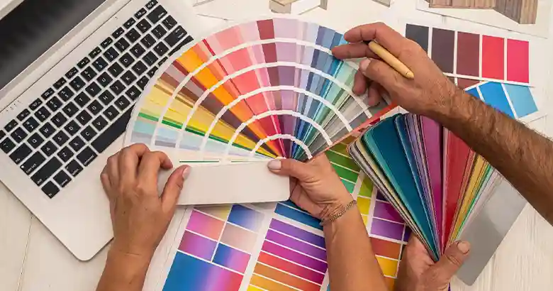
Colour is one of the most powerful and immediate communicators available to any brand. Research shared through the Canva Design School illustrates how specific colours reliably trigger specific emotional associations: blue conveys trust and professionalism, orange suggests energy and approachability, green evokes sustainability and growth, and so on. These associations are not universal, and cultural context matters, but within the UK market they hold reasonably consistent.
For social media, colour consistency is particularly important. When a brand uses the same palette across all its visual content, audiences begin to recognise posts before they have even read the brand name. This visual familiarity is a genuine competitive advantage; it means that each new piece of content benefits from the cumulative recognition built by everything that preceded it.
Designing for the Scroll
Effective social media design starts with a fundamental question: will this stop someone mid-scroll? High contrast, bold typography, and striking imagery all contribute to stopping power. Content that blends into the visual background of a feed, however beautifully composed, is content that will be overlooked.
White space, when used deliberately, can be just as powerful as visual complexity. A single bold statement in large type on a clean background often outperforms a densely designed graphic precisely because it stands out from the visual noise surrounding it. The most effective social designers understand that their work will be viewed alongside hundreds of other pieces of content and design accordingly.
Typography as Personality
The typefaces a brand uses on social media communicate personality as clearly as the words themselves. A serif font conveys heritage and authority; a rounded sans-serif suggests approachability and modernity; a handwritten style communicates warmth and informality. Mixing multiple conflicting typefaces within a single piece of content creates visual confusion that undermines the brand’s credibility.
Consistency in typography, like consistency in colour, builds brand recognition over time. Maintaining a defined typographic palette and applying it consistently across all social media content is one of the simplest and most effective ways to strengthen visual brand identity.
Video Design and Motion
For video content, the first two or three seconds are the critical design challenge. Social media videos autoplay without sound in most contexts, which means that visual storytelling must do the heavy lifting before the viewer has chosen to engage further. Bold opening frames, on-screen text captions, and motion that captures peripheral attention all contribute to the crucial early seconds that determine whether a viewer watches on.
Combining strong visual design disciplines with the strategic priorities of effective social media management from a company like 99social ensures that content is not only well-planned and consistently published but visually compelling enough to compete for attention in an increasingly crowded digital environment. Design and strategy, working together, produce results that neither achieves alone.